

| Origin of the Rule of Thirds | Attributed to painter and engraver John Thomas Smith, who described it in his 1797 treatise on landscape painting. (John Thomas Smith, Remarks on Rural Scenery, 1797) |
| Term: Negative Space | Also called 'white space' in graphic design contexts; widely used in both fine art and commercial visual disciplines. |
| Composition in Photography | Many of the same composition principles from painting were formally adopted into photographic education in the early 20th century. |
| Visual Hierarchy | Used not only in fine art but is a foundational concept in graphic design, web design, and advertising layout. |
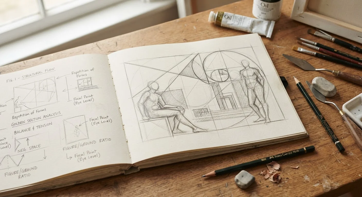
| Golden Ratio Connection | The rule of thirds is considered a simplified approximation of the golden ratio, a proportion observed in Renaissance painting and classical architecture. |
Why Composition Vocabulary Matters
Standing in front of a painting at a museum or scrolling through a photographer's portfolio, most of us sense that something is working - or isn't - without being able to name it. That intuition is real, but it has limits. Learning the vocabulary of visual composition doesn't drain the magic out of art; it deepens it. Suddenly you can articulate why a photograph stops you cold, or why one painting feels restless while another feels settled.
These terms are the shared language of painters, photographers, illustrators, and designers across centuries. Once you internalize even a handful of them, you'll look at images differently - whether you're visiting a gallery, flipping through a coffee-table book, or composing a snapshot on your phone. For a complementary set of concepts around hue and tone, see our plain-language color theory guide.
Focal Point
The area of an image that draws the viewer's eye first and holds attention longest. Artists create focal points through contrast, placement, detail, or color. Everything else in the composition typically supports or frames this dominant element.
Negative Space
The empty or background area surrounding the main subject of a composition. Far from being wasted space, it gives the subject room to breathe and can powerfully suggest mood, isolation, or scale. Many minimalist works rely almost entirely on negative space for their impact.
Rule of Thirds
A compositional guideline that divides the frame into a 3×3 grid and places key elements along the lines or at the intersections. This off-center placement tends to feel more dynamic and naturalistic than centering a subject. It's one of the first principles taught in photography and design.
Leading Lines
Lines within an image - a road, a fence, a shadow - that guide the viewer's eye toward the focal point or through the composition. They can be literal straight lines or implied curves, and they give a picture energy and direction.
Balance
The visual weight distribution across a composition. Symmetrical balance places similar elements on each side of an axis; asymmetrical balance achieves equilibrium through contrast, size, or color differences between unequal elements. Both approaches can feel stable, but asymmetry often creates more tension and interest.
Rhythm
A sense of movement or pattern created by the repetition of shapes, colors, lines, or textures throughout a composition. Rhythm can feel regular and calming - like a row of arched windows - or irregular and energetic, as in an expressionist brushwork pattern.
Foreground, Middle Ground, Background
The three spatial layers of a composition that together create a sense of depth. Objects in the foreground appear closest and largest; the background sits farthest away. How an artist balances these layers dramatically affects whether an image feels flat or dimensional.
Framing
Using elements within the scene - a doorway, branches, an arch - to surround and draw attention to the main subject. Natural frames focus the viewer's attention and add layers of depth and context to the image.
Contrast
The degree of difference between elements in a composition - light vs. dark, rough vs. smooth, large vs. small. High contrast tends to feel dramatic and bold; low contrast feels subtle and harmonious. Contrast is one of the most powerful tools for creating visual hierarchy.
Unity
The sense that all parts of a composition belong together and work toward a coherent whole. Artists achieve unity through consistent color palettes, repeated shapes, or a dominant mood. Without some degree of unity, a work can feel chaotic or unresolved.
Visual Hierarchy
The order in which the eye moves through an image, determined by size, color, contrast, and placement. A well-designed hierarchy leads the viewer from the most important element to supporting details in a logical, satisfying sequence.
Texture
The perceived surface quality of objects within a composition - rough, smooth, soft, jagged. In painting, texture can be literal (built-up brushwork) or implied (a smooth surface painted to look rough). Texture adds tactile richness and realism to a visual work.
Core Composition Terms Defined
The terms below appear constantly in art criticism, photography education, and studio practice. Think of them as tools in a visual toolkit - each one solves a different problem of how to arrange what the eye sees.
| Origin of the Rule of Thirds | Attributed to painter and engraver John Thomas Smith, who described it in his 1797 treatise on landscape painting. (John Thomas Smith, Remarks on Rural Scenery, 1797) |
| Term: Negative Space | Also called 'white space' in graphic design contexts; widely used in both fine art and commercial visual disciplines. |
| Composition in Photography | Many of the same composition principles from painting were formally adopted into photographic education in the early 20th century. |
| Visual Hierarchy | Used not only in fine art but is a foundational concept in graphic design, web design, and advertising layout. |
| Golden Ratio Connection | The rule of thirds is considered a simplified approximation of the golden ratio, a proportion observed in Renaissance painting and classical architecture. |
Putting the Terms to Work
These concepts rarely operate in isolation. A photographer framing a portrait along the rule of thirds might simultaneously use negative space to suggest loneliness, and a leading line to draw attention to the subject's face. Painters layer these decisions instinctively after years of practice, but naming them gives you access to that same conversation. For a practical walkthrough of noticing these elements in real artworks, visit our guide on what to notice when you stand in front of art. And if you want to see how composition plays out specifically in photography, our complete guide to photography as a visual art covers framing, light, and meaning in depth.
Composition Applies Beyond Fine Art
These terms aren't limited to museums and galleries. Graphic designers, filmmakers, architects, and UX designers use many of the same compositional principles every day. Understanding them gives you a richer vocabulary for engaging with the visual world in almost any context - from a movie frame to a website layout. Lighting also plays a major role in how composition reads; see our guide to professional lighting principles for how direction and quality of light interact with compositional choices.