

Key Takeaways
Color Theory
Color theory is a practical framework that explains how colors relate to one another, how they interact visually, and how they create emotional effects. It covers concepts like hue (the actual color), saturation (its intensity), and value (its lightness or darkness). Artists, designers, and photographers use these principles to make deliberate visual decisions - not just aesthetic ones. Understanding color theory helps you see why some combinations feel harmonious while others create tension.
Color theory draws from both physics (the visible light spectrum) and perceptual psychology (how the human eye and brain process color relationships). The traditional RYB (red-yellow-blue) model used in fine art differs from the additive RGB model used in digital screens and subtractive CMYK used in print.
The Three Properties You Actually Need to Know
Most people learn about color through crayons and paint sets - primary colors, mixing red and yellow to get orange, that sort of thing. But color theory goes a level deeper, and its core vocabulary is actually quite small. Every color you'll ever encounter has three defining properties: hue, saturation, and value.
Hue is simply what we casually call the color - red, blue, teal, amber. It's the color's identity on the spectrum. Saturation describes how vivid or intense that color is. A fire-engine red is highly saturated; a dusty rose is the same hue with the saturation dialed way down. Value refers to lightness or darkness - the same blue can be nearly white (high value) or nearly black (low value), and both are still recognizably blue.
Why does this matter beyond art class? Because every visual decision - in a painting, a film still, a photograph, or a graphic layout - is really a manipulation of these three variables. When you understand them, you start to notice them everywhere. For a deeper look at how these ideas connect to visual composition more broadly, see our guide to visual composition terms.
90%
Snap judgments influenced by color alone
Research cited by the Institute for Color Research suggests that up to 90% of an initial impression of a product or image is based on color, highlighting how quickly our visual system processes chromatic information.
3
Core color properties that define every hue
Hue, saturation, and value form the foundational triad of color description used across fine art, design, and digital imaging standards worldwide.
12
Color positions on the traditional artist's wheel
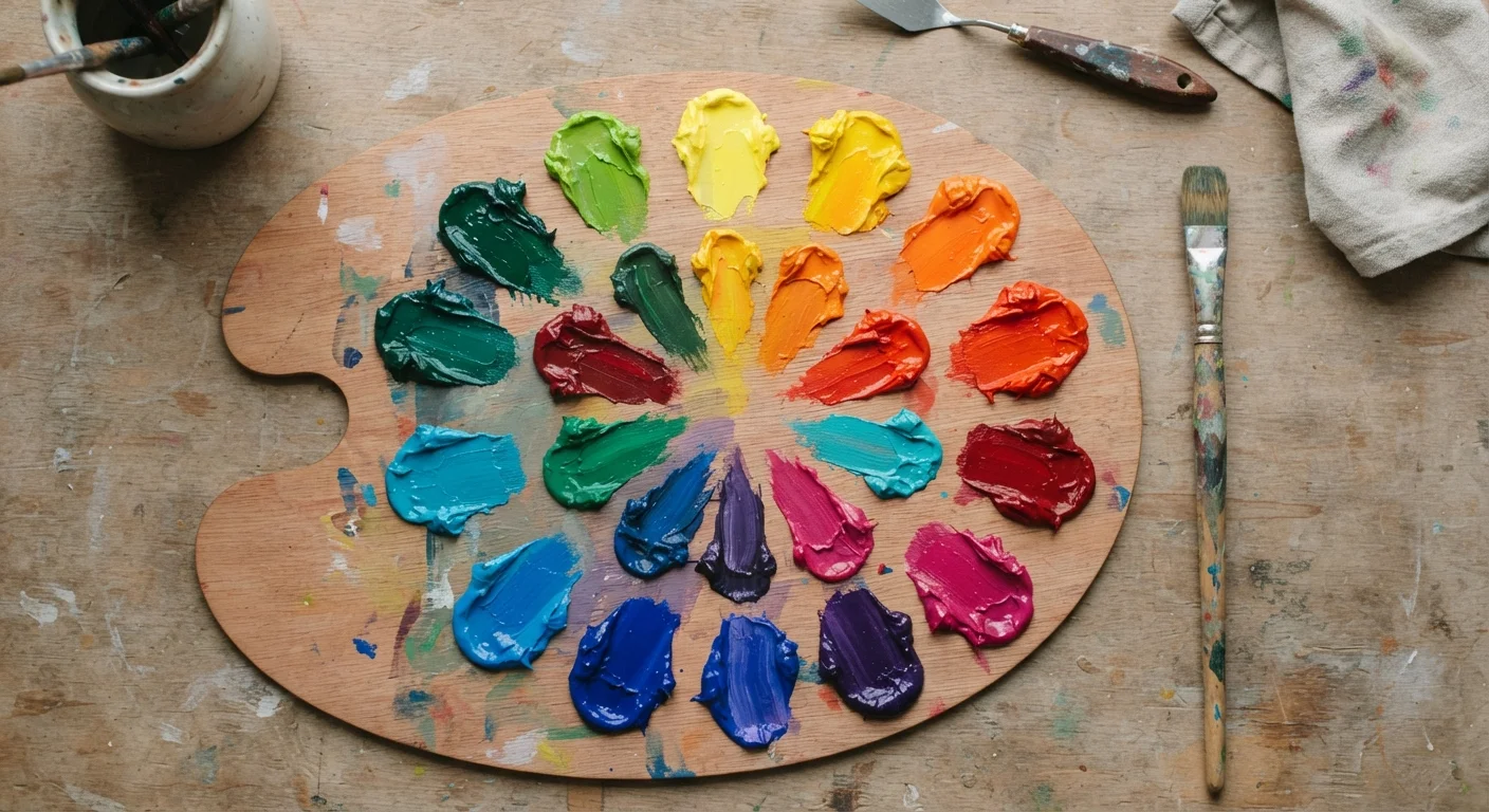
The standard RYB color wheel used in fine art instruction maps 12 positions - 3 primary, 3 secondary, and 6 tertiary colors - providing the basis for all classical color relationship analysis.
The Color Wheel and Why Relationships Matter
The color wheel - that circular diagram you may remember from school - is more than a classroom prop. It maps how colors relate to one another spatially, and those relationships predict how colors will behave when placed together.
Complementary colors are opposites on the wheel: red and green, blue and orange, yellow and purple. Place them side by side and they vibrate against each other with almost electric energy. Vincent van Gogh used blue-orange contrast obsessively for exactly this reason - the tension felt alive. Analogous colors are neighbors on the wheel (blue, blue-green, green), and they produce visual harmony that reads as calm and unified. Think of a landscape painting where the sky, water, and distant hills share a cool family of hues.
Triadic schemes use three colors equally spaced on the wheel - red, yellow, and blue, for instance - and tend to feel bold and balanced simultaneously. These aren't rigid rules so much as tested starting points. Artists deviate from them all the time, but knowing them helps you understand why a color choice feels intentional versus accidental.
“Color is a power which directly influences the soul. Color is the keyboard, the eyes are the hammers, and the soul is the piano with many strings.”
— Wassily Kandinsky, Abstract painter and art theorist, author of 'Concerning the Spiritual in Art'
Temperature, Depth, and Emotional Weight
One of the most powerful and counterintuitive ideas in color theory is that colors have apparent temperature - and that temperature creates the illusion of spatial depth on a flat surface. Warm colors (reds, oranges, yellows) seem to push toward the viewer. Cool colors (blues, greens, purples) seem to pull away. A skilled painter can create a convincing sense of three-dimensional space using only this principle, pushing the background into cool shadow while drawing warm light across the foreground.
Color also carries emotional weight - a quality that varies by culture but is widely recognized within shared visual traditions. Deep blue tends to evoke calm or melancholy; saturated red signals urgency or passion; muted earth tones suggest warmth and groundedness. These associations aren't arbitrary - they connect to lived experience, natural environments, and generations of cultural reinforcement.
Film directors and cinematographers are among the most sophisticated users of this principle. The cold blue palette of a thriller communicates unease long before a single line of dialogue. The golden warmth of a nostalgic memory sequence cues the audience emotionally before the narrative even frames what's being remembered. For more on how color plays into visual storytelling through photography, explore our photography as a visual art guide.
Putting It Together: How to See Color Purposefully
You don't need to be making art to benefit from color theory literacy. Standing in front of a painting at a museum, or even scrolling through a well-designed website, becomes a different experience when you can ask the right questions. Is the palette warm or cool - and what mood does that create? Are the colors saturated and energetic, or muted and contemplative? Is there a complementary contrast drawing your eye to a specific focal point?
These aren't trick questions with hidden answers. They're tools for becoming an active viewer rather than a passive one. The artist or designer made choices - and recognizing those choices is a form of visual literacy that enriches every encounter with images. Our article on reading a painting offers a practical framework for exactly this kind of attentive looking.
Color theory also extends well beyond canvas and paint. Graphic designers, fashion stylists, interior decorators, and lighting directors all draw on the same underlying principles. The language differs slightly depending on the medium - and graphic design approaches color differently than fine art in important ways - but the core logic is shared. Once you see it, it becomes remarkably hard to unsee.