

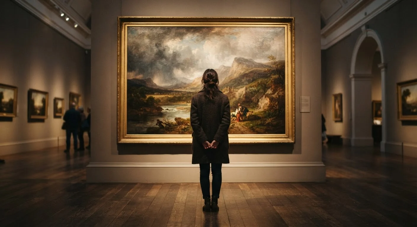
Key Takeaways
Why Most People Rush Past Paintings
Museum studies have long observed that the average visitor spends fewer than thirty seconds in front of any given artwork - enough time to glance, maybe read the label, then move on. This isn't a failure of culture or attention span. It's largely a failure of permission: most people simply don't feel equipped to know what they're looking for, so they don't look long enough to find it.
Reading a painting isn't a skill reserved for curators or critics. It's a form of slow, attentive looking that anyone can practice. The steps below give you a practical framework - not a rigid formula - for standing in front of a work and genuinely engaging with it. Think of it less like decoding a puzzle and more like learning to hold a real conversation.
For those interested in how this kind of visual literacy extends beyond the canvas, reading a film with the same attention follows a surprisingly parallel logic.
Your Step-by-Step Guide to Looking at a Painting
Use these steps whether you're in a major museum, a community gallery, or looking at a reproduction on a screen. The goal is to move from instinct to observation to understanding - in that order.
Stop and breathe - give yourself at least two full minutes
Before you read the label or search for meaning, simply stand still and let the painting exist in your field of vision. Two minutes feels longer than you expect. Resist the urge to move on. Your brain needs time to shift from scanning mode to observing mode, and that transition doesn't happen instantly.
Notice where your eye naturally goes first
Every painting has a point of entry - a place where your gaze lands instinctively. Identify it. Then ask: where does your eye travel next? Artists use line, contrast, and placement to choreograph this journey deliberately. Following that path reveals how the painting is structured, even before you know anything about its subject.
Describe the light
Ask yourself: where is the light coming from? Is it harsh or soft? Does it illuminate certain figures while leaving others in shadow? Light in painting is rarely decorative - it carries meaning. A figure bathed in warm light against a dark background communicates something very different from flat, even illumination across a crowd scene.
Read the color relationships, not just individual colors
Color in painting works through contrast and relationship rather than in isolation. A red that dominates one area pulls against a complementary green elsewhere; a desaturated background makes a vivid foreground pop. Ask whether the palette feels warm or cool overall, and whether that temperature matches or contradicts the subject matter. That tension - or harmony - is almost always intentional.
Look for what the artist chose to leave out
A painting is as much about its omissions as its inclusions. What is cropped at the edge of the frame? What details are blurred or barely suggested? What appears in shadow rather than in focus? Absence and suggestion are compositional tools as active as anything the brush marks directly. Empty or minimal areas - sometimes called negative space - shape the feeling of a scene just as much as its crowded, detailed passages.
Now read the label - and let context add, not replace, your reading
After forming your own observations, the title, date, and artist biography become genuinely useful rather than a crutch. Knowing that a work was made during wartime, or as a political commission, or as a deeply personal response to grief, layers onto what you already observed - it doesn't replace it. Historical and cultural context enriches a painting; it doesn't own the correct interpretation of it.
As you practice, you'll find that composition terms like focal point, balance, and negative space become naturally useful rather than intimidating jargon.
What to Do When a Painting Confuses or Unsettles You
Confusion in front of a painting is not a dead end - it's actually information. If a work makes you uneasy, ask why. Is it the color palette, something jarringly off in the proportions, or a subject matter that feels strange or taboo? These are all deliberate choices, and your discomfort is evidence that the work is doing something.
Abstract paintings especially reward this approach. Rather than searching for a hidden representational subject, try to describe the painting's energy or mood as you would describe weather or music. If you find yourself puzzled by work without recognizable objects, understanding what abstract artists are actually doing can open up a whole new way of seeing.
Confusion Is a Valid Starting Point
If a painting makes you feel unsettled or uncertain, resist the urge to dismiss it or move on. Sit with that reaction for a moment. Ask what specifically is generating it - the subject, the palette, the scale, the technique. Discomfort in front of art is often a sign the work is doing exactly what it was meant to do.
Color is one of the most powerful sources of emotional effect in painting, and it's one of the most misunderstood. Deepening your sense of how hue, saturation, and contrast work - explored in detail in our color theory guide for non-specialists - will sharpen your eye for nearly every artwork you encounter.