

Key Takeaways
Start here
Why Climate Data Can Feel Overwhelming
Build your vocabulary
Key Terms You Need to Know First
Read the charts
How to Read Temperature and Emissions Charts
Stay sharp
Red Flags: Spotting Misleading Climate Claims
Go deeper
Where to Find Trustworthy Climate Data
Why Climate Data Can Feel Overwhelming
Open any major climate report and you're confronted quickly with parts-per-million concentrations, anomaly baselines, radiative forcing values, and uncertainty ranges expressed as confidence intervals. For readers without a science background, the effect can feel like being handed a map written in a foreign language.
That reaction is understandable - and worth pushing past. Climate data is not inherently inaccessible. Most of the confusion comes from a handful of concepts that, once explained clearly, unlock the rest. The same critical reading skills that help you evaluate international news coverage - checking sources, questioning framing, looking for missing context - apply directly here. See our guide to reading international news skeptically for a parallel approach.
This guide focuses on the data itself: what the numbers mean, how the charts work, and where genuine uncertainty lives versus where manufactured doubt is being inserted.
Key Terms You Need to Know First
A small vocabulary goes a long way. Before diving into charts and figures, these are the concepts that appear most frequently in climate reporting.
Anomaly
The difference between a measured value and a long-term average baseline. On temperature charts, an anomaly of +1°C means the period was 1 degree warmer than the reference average, not that it was literally 1°C.
Baseline period
The historical time span used as a reference point for measuring change. Common baselines include 1951-1980 or 1981-2010 averages. Different baselines shift where a trend line sits without changing the underlying trend.
CO₂ equivalent (CO₂e)
A unit that converts different greenhouse gases into a single comparable measure based on their warming effect relative to carbon dioxide over a standard time period, usually 100 years.
Uncertainty range
The range of values within which the true measurement is likely to fall, given the limits of available data or methods. Wider ranges mean less certainty; they don't mean the data is wrong.
Radiative forcing
A measure of how much a factor - such as increased CO₂ - changes the energy balance of Earth's atmosphere. Positive values indicate a warming effect; negative values indicate a cooling effect.
Parts per million (ppm)
A unit expressing the concentration of a gas in the atmosphere. Atmospheric CO₂ concentration is measured in ppm - currently above 420 ppm, up from around 280 ppm before industrialization.
One distinction worth flagging early: climate and weather are not interchangeable. A single unusually cold winter does not contradict a warming climate trend, just as one high-calorie meal does not define a person's overall diet.
How to Read Temperature and Emissions Charts
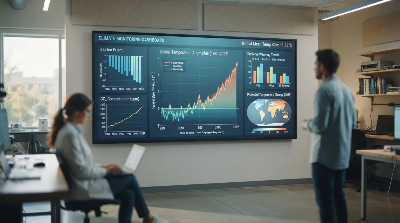
Most temperature charts you'll encounter don't plot raw degrees - they plot anomalies. That means each data point shows how much warmer or cooler a period was compared to a chosen baseline average, often the mid-20th century mean. A value of +1.2°C doesn't mean the world averaged 1.2°C; it means temperatures were 1.2 degrees above that historical reference point. Always check which baseline a chart uses, because different choices shift where the line sits without changing the underlying trend.
Always Locate the Baseline Before Reading a Chart
Before interpreting any temperature anomaly chart, find the baseline period noted in the legend or methodology section. Two charts showing the same data can look strikingly different if one uses a 1951-1980 baseline and another uses 1981-2010. Neither is necessarily wrong - they're measuring from different reference points. Knowing this prevents a great deal of confusion.
Emissions charts introduce their own conventions. Greenhouse gases are almost always reported in CO₂ equivalents (CO₂e), which converts methane, nitrous oxide, and other gases into a common unit based on their warming potential over a set time horizon - usually 100 years. This lets a single bar chart compare the climate impact of burning coal, raising cattle, and manufacturing cement side by side.
Pay attention to the y-axis scale. A chart that starts at a high baseline value can make a large change look small, while a truncated axis can make a modest change look dramatic. Neither is automatically dishonest, but both require the reader to notice the scale before drawing conclusions.
Red Flags: Spotting Misleading Climate Claims
Climate data is frequently misrepresented - not always through outright fabrication, but through selective presentation. A few patterns repeat often enough to be worth recognizing.
- Cherry-picked time windows: Starting a trend line at a peak year can make subsequent data look flat or declining, even if the long-term trend is upward. Ask what the trend looks like over 30 or more years.
- Conflating local and global: A cold snap in one region says nothing about global average temperatures. Climate trends are global and long-term by definition.
- Precision without uncertainty: Legitimate climate data always comes with uncertainty ranges. A source presenting numbers as perfectly exact - no error bars, no confidence intervals - is omitting crucial information.
- Misattributing causation: Correlation in datasets doesn't establish cause. A rigorous source will explain the physical mechanism linking variables, not just show two lines moving together.
Uncertainty Is Not the Same as Ignorance
When scientists report that global average temperature has risen 1.1°C (±0.1°C) above pre-industrial levels, the uncertainty range reflects measurement precision - not doubt about whether warming is occurring. Uncertainty ranges are a sign of scientific rigor, not weakness. A source that omits them is giving you less information, not more confidence.
The same analytical discipline applies to other data-dense topics. Just as reading a nutrition label requires knowing what serving size actually means before comparing products, reading a climate chart requires knowing what the baseline is before interpreting the trend. See our guide to decoding nutrition labels for a parallel example of data literacy in everyday life.
Where to Find Trustworthy Climate Data
Reliable climate data comes from institutions with documented, peer-reviewed methodologies and long track records of transparency. The following are widely cited by researchers and journalists worldwide.
NASA Global Climate Change
NASA publishes publicly accessible temperature records, sea-level data, and Arctic ice extent measurements with clear methodology documentation. A strong starting point for verifying commonly cited climate figures.
NOAA Climate.gov
The National Oceanic and Atmospheric Administration offers data visualizations, explainers, and historical climate records geared toward general audiences alongside technical users.
IPCC Reports
The Intergovernmental Panel on Climate Change publishes comprehensive assessments synthesizing thousands of peer-reviewed studies. Summary for Policymakers documents are written for non-specialist audiences.
Our World in Data - CO₂ and Greenhouse Gas Emissions
An open-access data visualization platform that pulls from primary scientific datasets and displays emissions, temperature, and energy trends in interactive, clearly labeled charts.
When evaluating any source, look for: published methodology, acknowledgment of uncertainty, and willingness to update when new data arrives. Credible scientific institutions do all three. Advocacy sites - on any side of the debate - may present accurate data selectively, so it's worth tracing figures back to their primary sources whenever possible.
This article provides general educational information about interpreting publicly available scientific data. It does not constitute scientific advice. Readers seeking detailed technical guidance should consult peer-reviewed literature and qualified climate scientists.